Posted by:
La Coacha on
Friday, September 17th, 2010 to
¡Qué Cute!


Here are the top three shoices:
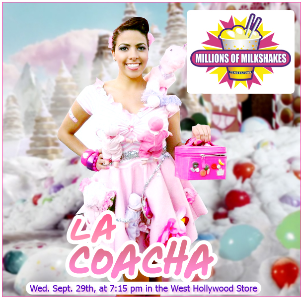
1). Design by Raúl Quiroz
- Ay look best in that foto, cuz ay am fotochopped. The Katy Purrdy background is cute too.
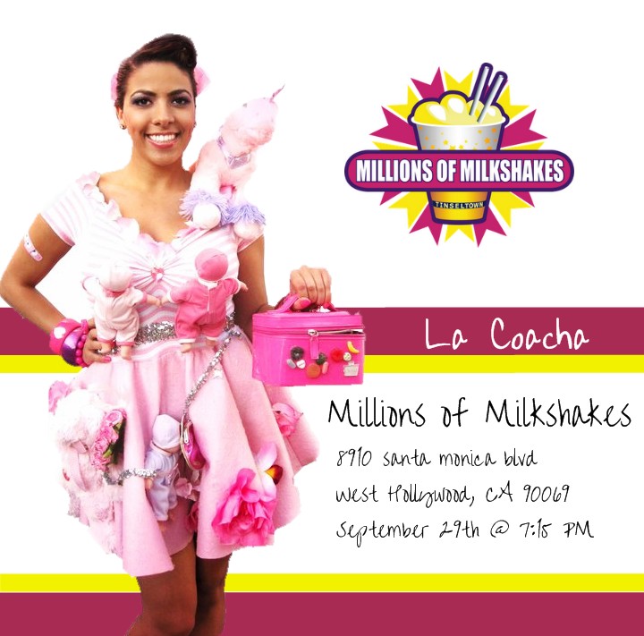
2). Design by Arturo Dominguez
The Millions of Milkchakes logo cutout, background y text is professional pero ay look too orange.
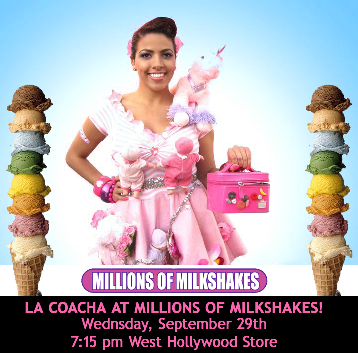
3). Design by S.Vedder
- Ay lub the icecream cones y the blue background, and the clear text.
The purrfect flier would be to get Raul’s clean foto of me and steek it on to Arturo’s background, and get the blue and juan of the icecream racks from Sofia. What joo guys teenk?


the second one is the best, just if he had photoshoped u a little it would be da bomb
el first one, numero uno, the vest
They all great but i Like #3 Best
your outfit’s a bit too washed out in the first pic so you can’t see the great detail. the font on the second one isn’t clear/bold enough. third one’s the best. you look great & the ice cream cones are awesome… except it’s called millions of milkshakes, not millions of cones, but whatev. it’s cute.
Coacha eres mi hit jajaja ya hice que todos vieran el vid de gagalupe :’D como me hiciste reir eh. Bueno de estos fliers pienso exactamente como tu nadamas que usando la letra de “La Coacha” del primero Sigue haciendo videos asi, estan chistosos y tu me caes super xD saludos desde gdl de tu hardcore fan de 14 años jaja me da risa lo que hago aqui
[...] Lee mas en: Chisme Time [...]
ok coacha… i don’t like neither.. asi que por que no checas mis galerias http://www.flickr.com/photos/frankysxy o http://www.flickr.com/photos/britneylover
pensaba en hacer algo como esto
http://www.flickr.com/photos/britneylover/3239867570/
and i also saw that you used one of my PS designs for you alejandro music video… this one:
http://www.flickr.com/photos/britneylover/3240210852/in/photostream/
jajaja
XOXO
LOVE YA
ps: contestame a mi correo [email protected]
pero el vid que sale gagalupe en alejandro eh y el de kardashian gurls
Numer 1! yay!
I like numero 3!!
number two coachita, DEFFFF!!
De first juan!!
La tercera . 3! coacha u look better on that picture
the third one
The 2nd one but with a bolder font! You blend in too much on the first or I’d like that one.
i like da second
i updated mine take a look http://i55.tinypic.com/33vi179.jpg
The second is the best. Go La Coacha, go! :))
i would pick the first one
or maybe the second one
but the first one is the best!
the 2nd one….
Number 1 for sure. It is pretty, it has the Millions of Milkshakes logo, and the location information is clear. I would go with 1… and you look great even without the photoshop.
333333333333
it’s really sad and annoying that you have to put el jefe perez’s video to play automatically on your blog. will definitely not be coming back to your blog again. keep your other job over at his blog not at yours. I come here to get away from him and you shove him down our throats, I am starting to hate you for it…
commom Paul please dont hate La coacha.
the 1st one is nice and the 3rd one
but for a flyer i think you should choose number 3 cuz it will look much better
I think the second one is pretty awesome after the changes he made… in the link above.